Think I might use this thread for my image manip stuff in general and not just planets... title still suits :D
Want to show a before and after look at what went into the image I used in 'A Corrupted Prize', and a bit of my process :)
Why? Partly for anyone who is curious, partly because process is exciting, and also partly for those who say it's 'amazing and magic I could never do that' - because you can, it's easy and just takes a bit of practice, and some good tools. If anyone shows any interest, would happily put together some Screenshot Fancy-Uppering tutorials.
Screenshot: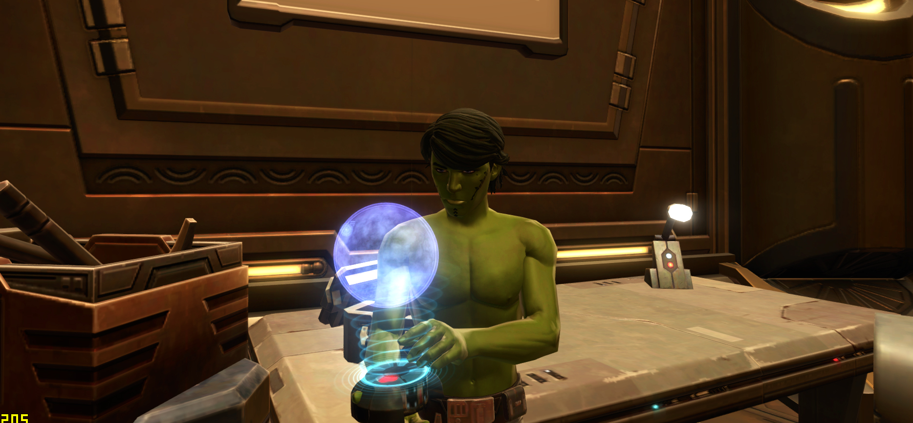 Final Image:
  Project:
 Cleanup!
The first thing I always do is clean up any rogue elements in the image. This includes things like clipping hair or clothing or fingers, and smoothing out the edges of the character's mesh. Sometimes it's a quick job, sometimes I'll agonize over it for hours, but the Clone Stamp tool and the Smudge Tool is always my friend.
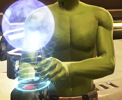
I did do an overall cleanup, but; problem areas, in this case, were mainly the thumb clipping through the holo-projection unit and them pointy elbows. Arms are usually the worst perps, followed closely by hair:
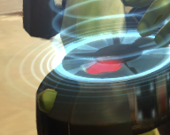
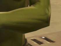
Aaand done:
 Physical Presence in a Scene:
 This is the smallest but most important aspect to really add more dimension.
Your character is influenced by about three 'layers' of lighting in the game - dynamic lighting, which is usually only present in cut scenes; global illumination, which is the lighting scheme you are affected by depending on location (Rishi vs. Nar Shaddaa); and your 'personal' light, which follows you around as you run about in game so you never have too much trouble being able to see your character, and which also casts your shadow while you go running about in the world (it changes depending on the area, but its sole purpose is to light you up, baby!).
This is the cheapest way to run lighting in an engine and seems to be the extent of SWTOR's capabilities - if every element of your environment was to have a different lighting effect on your character, your computer would crash before you could say 'Nox!'
However this can make characters stick out from a background as though they are an artificial element, floating above the influence of the world. It isn't too bad in an MMO, where you kinda want your character to pop off the screen a bit, but it can make your character look strangely 'not-present' in a screenshot. For instance, as you'll note from the original screenie above, Feyda's body is not interacting with the hologram at all, which should be casting light on him. Again - fine for the game, but really makes the image look flat.
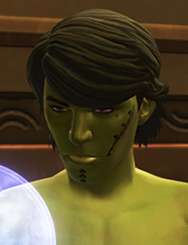
The quickest way to add more depth is a simple reflective glow in the eyes. Watch here how much the eyes pop and add mood and presence to the scene just after adding some reaction:
-->
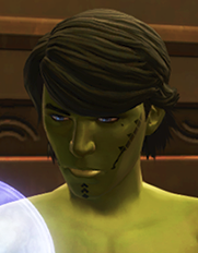
I did add some glow on his body after too, but honestly if I'd been lazy or pressed for time I could have left it like this and it would have been fine. He instantly feels more present in the scene, holding that hologram, and it even sharpens the emotion on his face.
After that, I in no particular (or great) order:
-
Added Belsavis to the hologram itself. Did this with a screenshot of the Belsavis planetary display deco, and added some layer effects to mimic the holo-look as you can see in the 'Belsavis_Overlay' layer.
-
Added some photo filters to give the impression of night. Be careful with this in PS as things will look lighter in the program prior to exporting and compressing a file. Originally my image was too dark, and will still look too dark on some monitors - in the end I went with the preview of it I saw on my housemate's Retina display.
-
Added a border. A simple 1px thick black line helps an image pop from the webpage.
Things I wanted to do but didn't:
-
Added body tattoos to Feyda. He has them, and I didn't draw them in, 'cuz I got
lazy busy.
-
Be super massively picky about perfectly blocking in the glow. Could have been better, but post-filter you barely notice the mistakes unless you're looking for them, or me.
And that's about it! If you've bothered to read this, thanks for taking an interest in my workflow :) I don't pretend to be any kind of expert, but I love sharing process as I love being able to see the process of others, as well.
